
Sand bathroom ideas start with a color decision most pages never make for you: which sand, at what depth, in which light. This page makes it.
Sand is a band, not a color. It runs from warm sand whites near LRV 84 down to deep camel taupes near 37, and most walls belong between 50 and 70.
The market is already moving this way. NKBA 2026 trend data puts neutrals at 96 percent of designer responses, with light brown and tan at 54 percent.
What follows is the decision layer the galleries skip. A paint table with verified LRVs, a grout table by tile type, an undertone test, and the maintenance truth.
Sand Bathroom Ideas in 60 Seconds
Short answer: pick a warm sand between LRV 50 and 70, layer it by the 60 30 10 rule, and let texture supply the contrast. That is the whole system in one line.
The default paint starting point is Accessible Beige at LRV 58. It sits mid band, coordinates with almost every warm material, and its undertone dispute is covered honestly below.
The grout rule is tonal and warm. Match the tile or go one shade deeper, and never pair warm sand tile with cool gray or stark white grout.
The bulb rule is 2700 to 3000K. Every source in the research agrees on this band, and cool bulbs are the fastest way to make sand look muddy.
The texture rule replaces color contrast. Honed stone, handmade glaze, ribbed wood and waffle cotton do the work a second color would do elsewhere.
What Sand Actually Is: The Band, Not a Color
Sand is the warm neutral family referenced to real beach and desert sand. A tan on a yellow orange base, low to moderate chroma, muted with a little gray or green.
That muting dose is what separates modern sand from 2000s beige. The older yellow beiges were saturated and shiny; today’s sand is quieter, more matte, and material led.
The retailer definition is usefully plain. Cream and ivory are warm whites; beige and sand are a step darker and more tan; taupe leans gray.
Sand is usually specified through materials as much as paint. Travertine, limestone and sand look porcelain carry the color in most real rooms, with paint supporting them.
Sand Versus Beige, Greige, Taupe, Clay, and Oatmeal
Sand versus beige: near synonyms, honestly. Sand skews yellower and more golden; beige skews pinker or grayer in many paint decks, and retailers group them as one family.
Sand versus greige: warmth is the difference. Greige carries a deliberate gray load, sits cooler, and can go flat in north light; sand stays warm on purpose.
Sand versus taupe: depth is the difference. Taupe is sand plus gray brown weight, usually under LRV 50; taupe reads mushroom, sand reads sunlit.
Sand versus clay: hue direction is the difference. Clay is red orange based and deeper, terracotta adjacent; sand is yellow orange based and lighter. The red direction belongs to our clay bathroom ideas.
Sand versus oatmeal: position is the difference. Oatmeal is paler and grayer, the family’s edge, as our oatmeal living room ideas show in living rooms; sand is the warm center.
Choose by the room you have, not the name you like. Cold light wants sand’s warmth, warm wood wants clay’s depth, and a gray leaning scheme wants oatmeal or greige.
The Paint Table: Sand Colors With Verified LRVs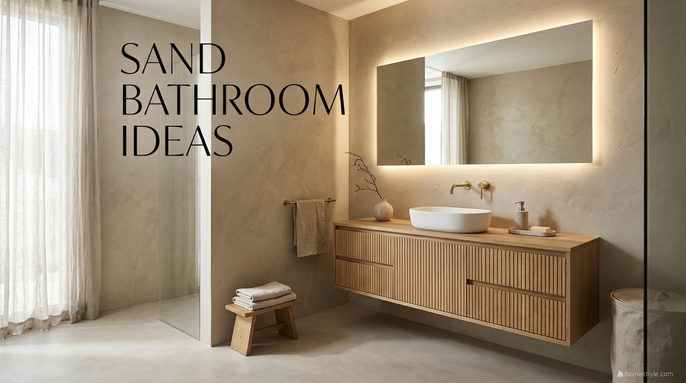
No ranking gallery prints a single LRV, so this table is the page. Every value below is sourced, and disputed values are printed as strands, never averaged into a fake precision.
|
Paint |
LRV |
Undertone read |
Best use |
|---|---|---|---|
|
Behr Blank Canvas DC-003 |
84 (manufacturer) |
Warm white, creamy beige |
Ceilings, trim, sand white walls |
|
Benjamin Moore Pale Oak OC-20 |
68.64 to 69.89 (strands) |
Greige, grayer edge of the family |
Windowless and low light rooms |
|
Benjamin Moore White Sand OC-10 |
66.95 |
Warm muted beige, orange lean |
Walls that must read sand by name |
|
Benjamin Moore Natural Cream OC-14 |
64.78 |
Light greige, warm leaning |
Walls, cabinets |
|
Benjamin Moore Manchester Tan HC-81 |
63.24 to 64.41 (strands) |
Warm yellow family, can flash green |
Walls in warm light |
|
Sherwin-Williams Accessible Beige SW 7036 |
58 |
Disputed: golden greige vs green strands |
The default mid sand wall |
|
Sherwin-Williams Sandbar SW 7547 |
About 53 |
Warm, taupe family |
Mid sand walls, vanities |
|
Sherwin-Williams Balanced Beige SW 7037 |
46 (strand) |
Warm beige, gray moderated |
Accents, cabinets |
|
Sherwin-Williams Tony Taupe SW 7038 |
About 37 |
Warm gray brown, can flash green |
Deep anchor, vanity, one wall |
Why two numbers appear for two paints. Different reputable datasets publish slightly different LRVs for Manchester Tan and Pale Oak, so both strands are shown and neither is hidden.
One famous outlier is excluded on purpose. A single blog claims Sandbar sits at LRV 64, against manufacturer derived data near 53; it is an error, and it is not in the table.
Farrow and Ball is handled differently for a factual reason. The brand publishes no LRVs at all, so its sandy colors (Drop Cloth No. 283, Jitney No. 293) carry third party estimates only, and this table prints none.
The manufacturer’s own words help place Manchester Tan: the Benjamin Moore Rocky Mountain palette describes it as sandstone meets khaki and calls Pale Oak a greige, which matches the table’s ordering exactly.
Accessible Beige’s undertone dispute deserves its own paragraph. Paint data sources describe a warm golden greige; two color consultancies describe a green undertone. Both agree it is warm; your light decides the flash.
A buying pattern repeats in the research. One coastal gallery even credits Accessible Beige to the wrong manufacturer entirely, which is why this table checks every claim against manufacturer derived data first.
Use the band, not just the names. Walls at 58 to 69 for most rooms, 46 to 53 for moodier schemes, and 37 reserved for anchors like vanities and single walls.
Extend the family beyond the bathroom. our sand living room ideas show the same band running a living room, which helps when the ensuite and bedroom need to agree.
The Undertone Test: A Protocol, Not a Guess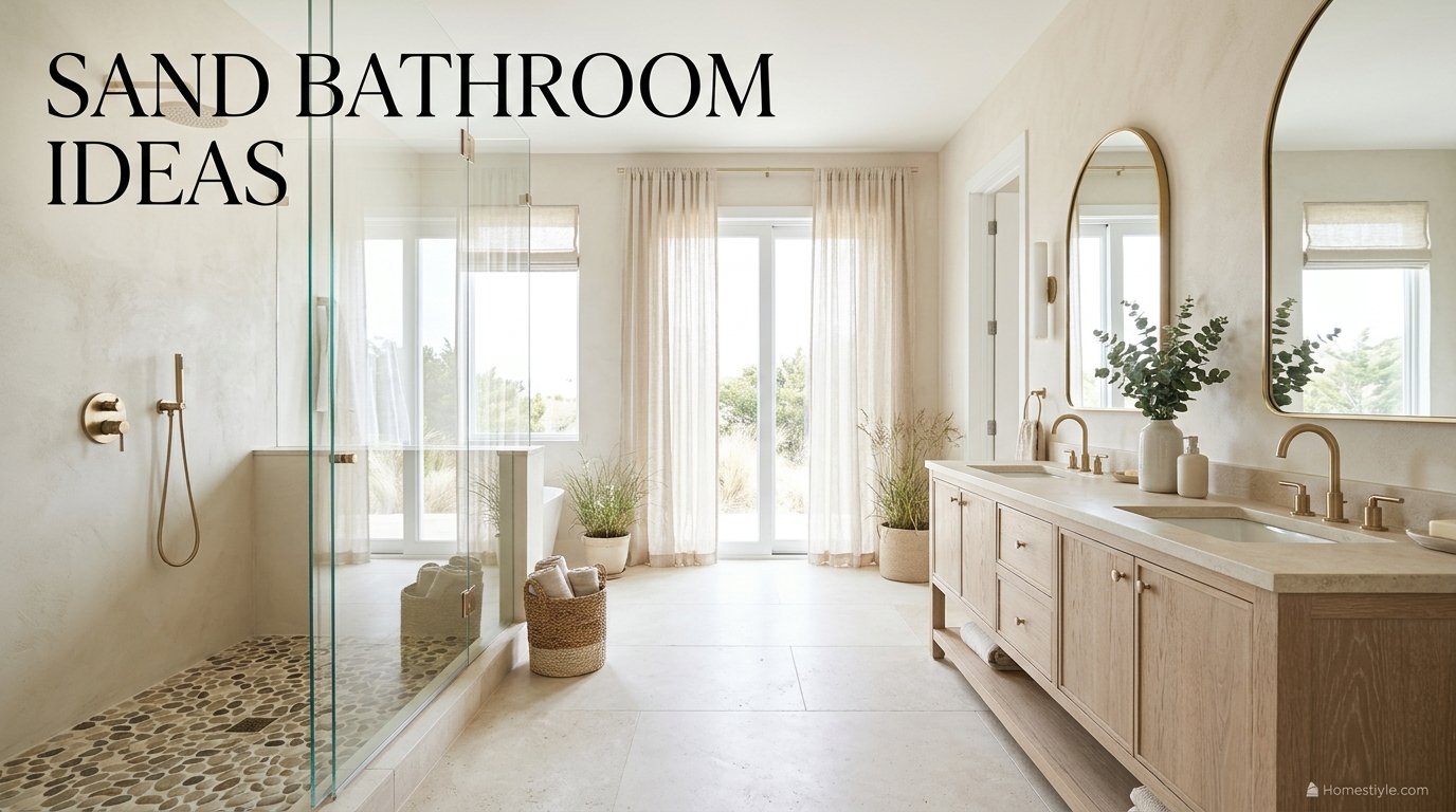
Undertone failures are the number one sand mistake. The paint is rarely wrong; the test was. Run this protocol before any full purchase.
Step 1: paint a large board, not a stripe. Two coats on a foam board at least A3 size, so the color shows its real depth and undertone.
Step 2: isolate it with white paper. Hold plain white paper beside the board; your eye reads the undertone (yellow, pink, or green) against the neutral reference immediately.
Step 3: stand it beside the fixed materials. Tile, stone, vanity wood and metal do not change; the paint must agree with them, not with the store’s wall.
Step 4: check it in three lights. Morning light, afternoon light, and your actual bathroom bulbs at night. Pink and green flashes appear in exactly one of the three.
Step 5: live with the finalist for a day. Tape the board up and look at it while you use the room; sand shifts more across a day than saturated colors do.
North Facing, South Facing, and Windowless Rules
North facing rooms cool everything. Choose a lighter, golden sand at LRV 60 plus, and be careful with the green leaning strands, which cold light can expose.
Manchester Tan and Tony Taupe both carry green flash reports. In warm light they are beautiful; in cold north light the flash is the documented risk, so the test matters most there.
South facing rooms forgive almost any sand. Warm light deepens the family kindly, so mid band colors like Sandbar can run without washing out.
Windowless rooms need an LRV floor. Low LRV color in a windowless box reads muddy; step up into the Pale Oak and Natural Cream zone and add layered lighting.
The pink trap has a specific cause. Green based gray neighbours make nearby beige read pinker; if your tile or grout leans green gray, expect the wall to blush.
Tile and Stone: Travertine, Limestone, Zellige, and the Porcelain Substitute
Travertine is the default sand stone. Honed, not polished, with natural pitting that reads as texture in the Intrigue House warm neutral tile ideas, and the pitting is the point.
Limestone is the quieter sibling. Paler and more uniform than travertine, it suits walls and floors where the scheme wants calm over character.
Zellige supplies movement inside one color. The handmade glaze varies tile to tile, so a single sand tone still shimmers; porcelain zellige look keeps the variation without the handmade price.
Sand look porcelain is the practical substitute. Non porous, consistent, and free of sealing duties, as the Tilezz beige and cream tile guide sets out in its tile guidance; matte floor rated versions are the family’s workhorse.
Terrazzo plays a supporting role. It appears in trend coverage, but the ranking leaders build on stone and zellige, so treat terrazzo as an accent rather than the lead.
Microcement and tadelakt remove grout lines entirely. Plaster finishes give a continuous sand wall; the material is modest and the labor is the premium, especially in small rooms.
Pebble tile owns the shower floor. Small pieces mean grip and many grout lines, and one coastal scheme runs the pebble continuously from the main floor into the shower for a wet sand transition.
Honed marble with beige veining is the luxe strand. It layers beautifully over sand, but it is still real stone, with the sealing and care duties covered in the maintenance section.
Pair glazed and unglazed for depth. A travertine floor with a glazed zellige wall bounces light differently across the room, which is how one color avoids flatness.
Carry the material logic into the bedroom later. The same warm band runs the bedroom in our sand bedroom ideas, so a primary suite can share one palette.
The Grout Table: Pairings by Tile Type
Grout is where sand bathrooms quietly succeed or fail. The tile guidance, especially the Emilamerica beige porcelain and grout guide, is specific: tonal, warm, and matched to the tile’s job.
|
Tile |
Grout choice |
Why |
|---|---|---|
|
Honed travertine |
Bone or sand, matched |
Keeps the stone continuous, hides pitting contrast |
|
Limestone |
Warm light gray, one shade deeper |
Slight definition without a grid look |
|
Zellige, sand tones |
Matched warm grout |
The glaze variation is the pattern, not the lines |
|
Porcelain sand look floor |
One shade deeper than tile |
Hides wear and traffic |
|
Pebble shower floor |
Mid tonal sand |
Grip lines disappear into the mosaic |
|
Feature wall, deliberate contrast |
Charcoal, sparingly |
Graphic contrast is a choice, not an accident |
Never pair warm tile with cool gray grout. The documented effect is perverse: the cool line makes the warm tile read even more yellow by comparison.
Never use stark white grout with cream or sand tile. It reads cold, makes the tile look yellow, and shows dirt faster than a tonal line does.
Floors take the deeper end of tonal. A grout one shade deeper than the floor tile hides wear; walls can sit closer to matched.
Remember what actually needs sealing. Cement based grout lines take a sealer; porcelain and ceramic tile bodies do not. Stone tile is its own case, next sections down.
The galleries repeat this warning constantly, and the Courtneys World beige bathroom gallery calls out cool grout and cool bulbs in item after item, which tells you how often readers get it wrong.
The 60 30 10 System: Layering a Near Monochrome Room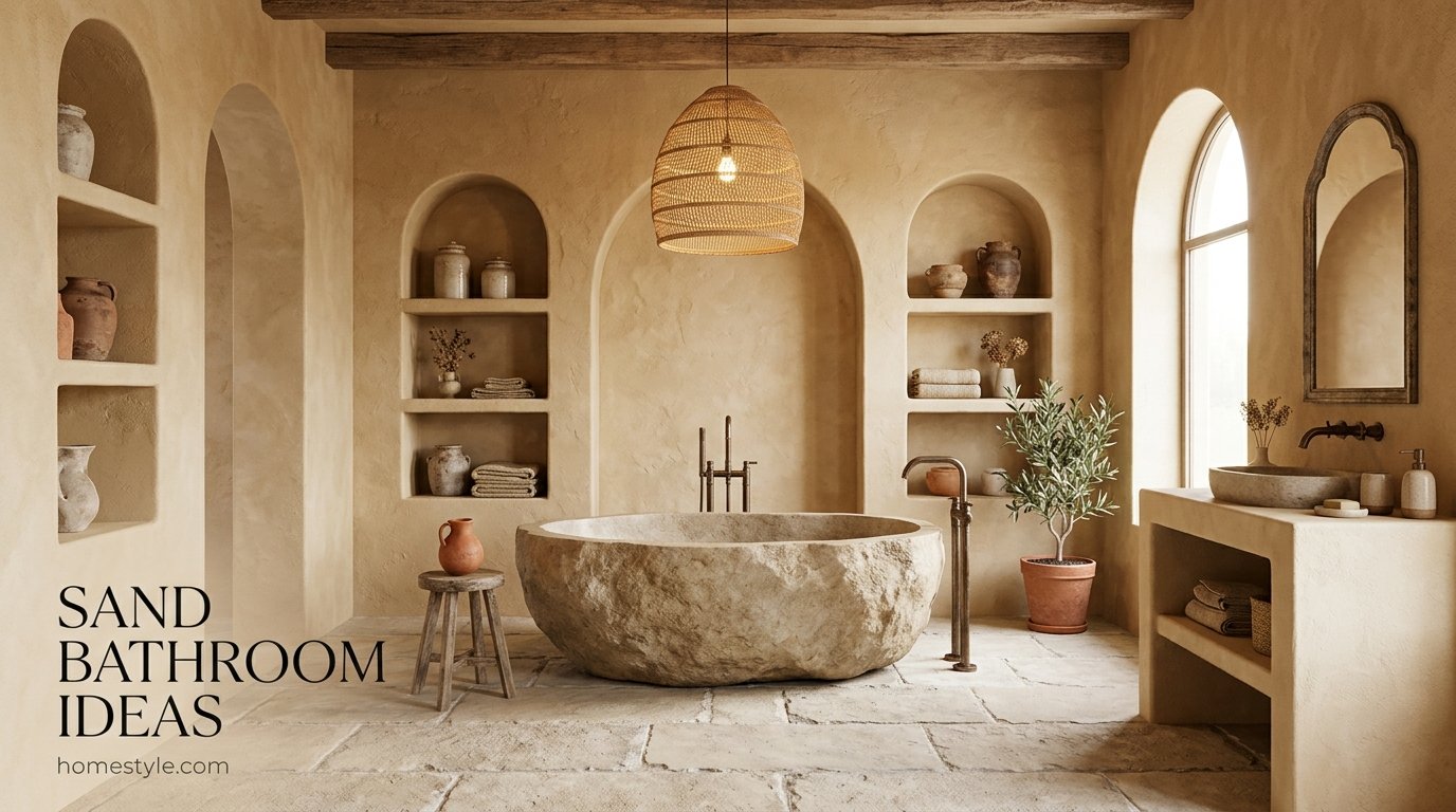
The ratio is the scheme. Sixty percent pale sand base (walls, large floor), thirty percent mid sand (vanity, shower tile, paneling), ten percent deep anchor (clay, charcoal, or walnut).
The larger the surface, the lighter the tone. That single rule, repeated across the research, prevents the heavy, muddy version of this palette.
The anchor is not optional. A room with no deep tier reads washed out in photographs and in person; walnut, clay or charcoal at ten percent fixes it.
Texture Replaces Color: The Contrast Mechanism
In a near monochrome room, texture is the contrast. Where other schemes change color, sand schemes change surface: rough stone against smooth glaze, ribbed wood against flat plaster.
Build the texture kit deliberately. Honed travertine, handmade zellige, white oak grain, waffle weave towels, woven baskets and a linen curtain give six distinct surfaces in one color family.
Light finishes the texture work. A strip or sconce grazing a textured wall manufactures depth that flat color cannot, which the gallery sources demonstrate repeatedly.
The style families later in this page are all this system in costume. Spa, coastal and Japandi differ in props, not in the layering underneath.
Green siblings show the same layering in another hue. our eucalyptus green bathroom ideas layer tone and texture the same way, and our moss green bathroom ideas run the deeper version.
Vanities and Wood: White Oak, Walnut, and the Bleached Strand
White oak is the house vanity wood. Light, warm and grain visible, it sits inside the family without competing; floating versions are the small bathroom default.
Fluted and ribbed oak fronts add a texture tier. The shadow lines do contrast work, which matters in a one color scheme.
Sun bleached and driftwood finishes serve the coastal strand. They read lighter and grayer than white oak, so test them against your sand for a cool clash.
Walnut is the anchor wood. At the ten percent tier (a vanity, a stool, frames) it supplies the depth pale schemes need.
Rattan and woven fronts are texture, not theme. Used once, they warm a scheme; used everywhere, they tip it into costume.
Match wood temperature to paint temperature. A golden sand with a cool gray stained vanity fights quietly all day; the undertone test board belongs beside the wood sample too.
Bedrooms prove the pairing at larger scale. our clay bedroom ideas and our eucalyptus green bedroom ideas show warm wood carrying deeper wall colors, the same logic inverted.
Metals: Brass by Default, Black as the Anchor, Chrome Contested
Brushed brass and champagne gold are the consensus default. Color consultants call brass the gold standard for beige schemes, and the galleries agree in room after room.
Unlacquered brass and aged bronze are the patina strand. They darken and vary with use, which suits stone and plaster; buy them only if you like change.
Matte black is the contrast system. For contemporary sand rooms, black hardware acts as the deep anchor in metal form and photographs sharply.
Chrome is genuinely contested. One gallery condemns it against warm schemes in several rooms, then permits it with taupe in another; brushed finishes are the safe consensus, chrome is a deliberate risk.
Brushed nickel is the quiet middle. Warmer than chrome, cooler than brass, it works where existing fittings must be kept.
Keep one metal family per room. Two finishes maximum, with the second repeated at least twice, is the discipline the better guides follow.
Warm metals flatter warm light. Under 2700K bulbs brass glows and chrome blues; the bulb choice and the metal choice are one decision.
Lighting: The 2700 to 3000K Band and Layered Sources
The cheapest high impact move in the whole research is a bulb swap. Start there: the 101 Home Decor warm neutral bathroom guide leads with it: change to 2700K first, before repainting anything, because cool light makes good sand look wrong.
Layer the sources. A backlit mirror, sconces at face height and a soft overhead replace the single ceiling light that makes beige look muddy.
Overhead only lighting flattens texture. Grazing light across stone and zellige is what turns the texture kit into visible depth.
Dimming extends the palette’s range. Sand at low warm light reads candlelit and calm; the same room at full cool light reads office. Dimmers are a color tool here.
Check paint under the final bulbs. The undertone test’s third light is your installed lighting, not the store’s, and it is the light you will live with.
Small Sand Bathrooms: The Method That Makes Them Read Bigger
Small rooms are where sand outperforms white. Light sand reflects light almost like white, without the clinical edge, and the Room Ideas Daily small beige bathroom guide rests its whole small room method on that claim.
Tonal continuity blurs boundaries. Wall, floor and shower in one family removes the visual cuts that make small rooms feel chopped up.
Large format tile cuts grout lines. Fewer lines, calmer surfaces, bigger read; reserve small formats for the shower floor where grip matters.
Float the vanity. Visible floor underneath reads as more floor, and the research calls wall hung non negotiable in small beige bathrooms.
Stay in the light half of the band. Walls at LRV 60 plus, mid tones on the vanity only, deep tones in accessories you can change.
Mirror generously and light it well. A wide mirror doubles the light you have, and warm layered light keeps the reflection kind.
The method transfers from other calm schemes. our forest green bathroom ideas use continuity and restraint the same way, in a much deeper color, which proves the method is structural, not chromatic.
Style Families: Spa, Coastal, Japandi, Mediterranean
Spa is the dominant frame. Stone, oak, brass, waffle cotton and one plant; the palette’s calm is the product, and most gallery rooms are secretly spa rooms.
Coastal treats sand as a literal reference. Pebble floors, bleached wood and linen, kept tasteful by restraint: the beach is implied by materials, never printed on a sign.
Japandi runs the palette with discipline. Microcement, pale oak, low contrast and empty surfaces; sand is one of its core neutrals alongside clay and charcoal.
Mediterranean and Southwestern push sand toward clay. Plaster walls, terracotta accents and bronze; our clay bathroom ideas sit at that border from the other side.
Warm minimalism strips the props. One stone, one wood, one metal, nothing else; the texture kit does all the talking.
Pick one family and edit ruthlessly. Mixed family rooms are how sand bathrooms turn into beige storage. One story, told in materials, is the goal.
See the band at room scale before committing. our champagne living room ideas show a neighbouring warm neutral running a full room, useful for judging depth and light.
Cleaning and Maintenance Reality: Stone, Porcelain, and Water Spots
The honest table nobody else prints. Sand’s reputation for forgiveness is real but material dependent; here is the whole picture in one place.
|
Material |
Sealing |
Water spots and dust |
Watch out for |
|---|---|---|---|
|
Porcelain sand look |
None |
Hides spots well (retailer strand) |
Grout lines still need sealing |
|
Honed travertine |
Yes, on a schedule |
Good when sealed |
Porous: absorbs water and stains unsealed |
|
Limestone |
Yes, on a schedule |
Good when sealed |
Softer stone, marks more easily |
|
Zellige (glazed) |
Grout only |
Glaze wipes clean |
Uneven surface, grout is the weak point |
|
Microcement and tadelakt |
Sealed system |
Wipes clean |
Installer quality decides durability |
The stone warning is explicit in the trade sources. Natural stone is porous, absorbs water and stains, needs proper sealing, and can be slippery when wet and cold underfoot.
The water spot claim is a strand, labelled. A tile retailer and a beach decor source both say warm sandy neutrals hide dust and water spots better than pure white; plausible, widely repeated, not lab data.
Heated floors answer the cold underfoot point. If real stone wins your heart, budget the heat mat; it converts the stone’s worst trait into its most luxurious one.
Waffle weave is a maintenance choice too. It dries faster than plush terry in poorly ventilated bathrooms, which is why it recurs in the small bathroom research.
Deeper greens hide a different set of sins. our moss green bedroom ideas show moss tones forgiving scuffs and shadows in bedrooms; sand’s forgiveness is about water and dust instead.
Accessibility in a Low Contrast Room: The 30 Point Rule and the Fixes
Low contrast is this palette’s one real weakness. Walls, floor and fixtures within a few LRV points of each other are genuinely harder to read for low vision users.
A benchmark exists, with an honest flag. UK accessibility guidance in the BS 8300 tradition uses a 30 point LRV difference between critical surfaces as the visibility benchmark; US rules set no general bathroom color contrast ratio.
You do not need to abandon sand to fix it. Put the deep tier where eyes need it: a walnut or deep sand vanity against pale walls clears the difference at the fixture that matters most.
Matte black hardware doubles as a contrast anchor. Handles, grab bars and taps in black are findable by touch and by eye against pale stone.
Floor to wall distinction is the safety core. One tier deeper on the floor (or the reverse) separates the planes without leaving the family.
Lighting is an accessibility feature here. Layered, shadow free light raises effective contrast more honestly than repainting a calm room into a loud one.
Sand Bathrooms on a Budget: Paint Only, Cosmetic, Full Retile
Tier one is paint, bulbs and textiles. A mid band sand on the walls, 2700K bulbs, waffle towels and a linen curtain; this is most of the effect for the least money.
Tier two is cosmetic surface work. Paint plus a porcelain sand look floor or a zellige look splashback, new brass hardware and a mirror; no plumbing moves.
Tier three is the full retile. Stone or porcelain throughout, plaster if you want it, floating oak vanity. Price the sealing and heating duties into stone choices at this tier.
Spend in the order the eye notices. Walls and light first, floor second, fixtures third, accessories last. The research’s cheapest first move (bulbs) outperforms most product swaps.
Samples are the highest value spend in the whole project. Two or three large sample boards cost little and prevent the only expensive mistake this palette offers: the wrong undertone at full scale.
Rental Sand Bathrooms: No Renovation Required
Renters can have this palette. Every rental route is reversible: paint where permitted, textiles, a shower curtain in linen look sand, and peel and stick options used cautiously.
The textile kit does most of the work. Waffle towels, a sand bath mat, a woven basket and a curtain in the family move a white rental bathroom most of the way to sand.
Warm bulbs are the renter’s secret weapon. They cost almost nothing, need no permission, and shift a cool white room toward sand more than any accessory.
Peel and stick tile needs an honest note. In wet zones it fails early and can cost a deposit; keep it to dry walls and floors outside splash range, and check the lease first.
Take the palette with you when you leave. Everything in the rental tier is portable, which is the tier’s real advantage over renovation.
Resale: What the NKBA 2026 Data Says About Neutrals
Neutrals are the market’s stated direction. In the NKBA 2026 data (see the Illustrarch tile color roundup carrying the NKBA 2026 data): 96 percent of respondents named neutrals the popular direction, with off white at 58 and light brown and tan at 54 percent.
Sand sits squarely in that majority. A well kept sand bathroom reads current and safe to buyers, which is more than can be said for the cool gray schemes it replaces.
Both big paint brands chose warm for 2026. Sherwin-Williams picked a warm khaki greige and Benjamin Moore a deep warm charcoal, per trade coverage; the warm direction is industry wide (strands, labelled).
Condition beats color at sale time. Sealed stone, clean grout and working warm light sell the palette; neglected grout unsells any color.
Mistakes That Make Sand Bathrooms Fail
Mistake one: skipping the sample test. Full room purchases on a chip’s promise cause the pink and green flash disasters; the protocol in this page exists for this mistake.
Mistake two: cool gray grout on warm tile. The single most repeated warning in the research, because it ruins otherwise good rooms quietly.
Mistake three: no deep tier. All pale everything reads flat and washed out; one anchor at ten percent is structural, not decorative.
Mistake four: one texture. A single surface in a single color is the flat room everyone fears; six textures is the fix.
Mistake five: cool bulbs. 4000K light over a warm scheme undoes the paint choice nightly.
Mistake six: unsealed stone in the shower. Porous stone without its sealing schedule stains early and permanently.
Mistake seven: mixing style families. Spa calm plus coastal signage plus farmhouse hardware is three rooms arguing; pick one story.
Frequently Asked Questions
1. Will a beige bathroom look outdated or dirty?
Only the wrong sand does. Dated beige means saturated yellow, shiny surfaces and cool light; warm sand with texture, tonal grout and warm bulbs reads spa calm instead.
2. How do I keep a small beige bathroom from looking too dark?
Stay light and continuous. Walls in the LRV 60 plus zone, one family across wall and floor, large format tile, and a floating vanity keep small rooms bright.
3. What are the best accent colors to pair with a beige small bathroom?
Clay, terracotta, charcoal or walnut. The deep tier of the warm family at about ten percent is the accent system the layering rule prescribes.
4. Is tadelakt or microcement expensive to install in a small bathroom?
Labour is the premium, not the material. Plaster materials are modest; skilled application costs, and small rooms keep the total contained.
5. What goes with beige tile?
Warm wood, brass and tonal grout. Oak beside it, brushed brass on it, bone or sand grout around it; cool gray grout and stark white grout are the pairings to avoid.
6. Is beige tile good for a bathroom floor?
Yes, in matte porcelain. Non porous, no sealing, and warm neutrals hide dust and water spots better than pure white on retailer guidance; natural stone floors need sealing and grip care.
7. How do I choose the right beige undertone?
Test, never guess. Paint a large board, isolate it with white paper, stand it beside your tile and metal, and check it in morning, afternoon and bulb light.
8. Which beige tiles suit a shower floor?
Small format with many grout lines. Pebble tile and small mosaics give grip; polished stone on a shower floor is the slippery option to avoid.
9. What grout suits beige tiles?
Tonal and warm. Match the tile or go one shade deeper in bone or sand tones; floors take the deeper end because it hides wear.
10. What colours pair well with beige tiles?
Cream above, oak beside, one deep anchor. Warm white up top, warm wood at the vanity, brass or black metal, and clay or charcoal as the single accent.
11. What colors go with beige tile?
The warm family first. Cream, sand and taupe layer safely; walnut and clay anchor; cool grays fight warm tile except in small, careful doses.
12. What grout color works with beige tile?
Bone, sand or warm light gray. Cool gray grout makes warm beige read more yellow, and stark white grout reads cold and shows dirt.
13. Is gray completely out of style for bathrooms?
As the main scheme, yes. The 2026 trend strands put warm neutrals in front; gray survives inside greige and as small accents.
14. Is cool gray tile still in style in 2026?
The direction is warm now. NKBA 2026 data puts neutrals at 96 percent of responses, with light brown and tan at 54 percent.
15. Why do some neutral bathrooms feel warm and others feel flat?
Undertone, light and texture decide. A warm scheme under cool light, or one texture everywhere, reads flat; layered materials and warm bulbs are the difference.
16. What are warm neutral colors?
The yellow, red and brown based neutrals. Beige, sand, cream, taupe, greige and oatmeal; sand sits in the yellow orange part of that family.
17. What color is sand paint?
A warm tan between off white and mid taupe. Yellow orange based, low to moderate chroma, with the working wall band at LRV 50 to 70.
18. Is sand a warm or cool color?
Warm, always. Its base is yellow orange; individual paints shift golden, pink leaning or green leaning inside warm, but none is a cool color.
19. What colors go with sand in a bathroom?
Cream, oak, brass and one anchor. Warm white above, warm wood beside, brushed brass as metal, clay or charcoal at ten percent.
20. Does sand go with grey in a bathroom?
With warm gray, carefully; with cool gray, no. The documented fight is grout: cool gray lines make warm sand tile read yellow.
21. What is the best grout color for sand colored tiles?
A tonal warm grout. Matched to the tile or one shade deeper; bone and warm sand tones are the named choices across the tile sources.
22. Should grout be lighter or darker than sand tile?
Match, or one shade darker. Darker on floors hides wear; much lighter grout, especially stark white, makes sand tile look yellow and ages fast.
23. Is beige coming back in 2026?
The data says it leads. NKBA 2026 respondents named neutrals at 96 percent, tan at 54 percent, and both major paint brands chose warm colors of the year.
24. What is the difference between sand and beige?
Sand skews golden, beige skews pinker. Near synonyms in the trade; sand is also specified through materials like travertine, while beige lives mostly in paint decks.
25. What is the difference between sand and greige?
Greige carries gray; sand stays warm. That gray load makes greige cooler and prone to going flat in north light, where sand keeps its warmth.
26. Sand vs clay bathroom: which is warmer?
Both are warm; clay is deeper and redder. Sand is yellow orange based and lighter, clay is red orange based and terracotta adjacent.
27. Sand vs oatmeal: what is the difference?
Oatmeal is paler and grayer. It maps to the light greige cream zone at the family edge; sand is deeper, more golden, the centre.
28. Does a sand bathroom make a small bathroom look bigger?
Yes, with the method attached. Light band walls, tonal continuity, large format tile and a floating vanity; color alone is not the trick.
29. What is the best sand paint color for a north-facing bathroom?
A lighter, golden sand, tested. North light cools everything and exposes flashes; stay at LRV 60 plus and treat green leaning strands with care.
30. Why does my beige paint look pink?
A pink undertone exposed by light or neighbours. Green based grays nearby make beige read pinker; the white paper isolation test shows whether the pink is in the paint.
31. Why does beige paint look gray in my bathroom?
Cool light is draining it. A north window or cool bulbs strip warm pigment visually; warmer bulbs at 2700 to 3000K and a warmer sand are the fixes.
32. What LRV is best for a small bathroom?
Walls at LRV 60 plus in small rooms. The sources work in bands: light walls keep small and windowless rooms out of the muddy zone, mid and deep sands go on vanities and accents.
33. Is Accessible Beige a good bathroom color?
Yes, as the default mid sand. LRV 58 and coordinates everywhere; its undertone is disputed between golden and green strands, so sample it in your light.
34. What is the undertone of Accessible Beige?
Disputed, honestly. Paint data sources say warm golden greige; two color consultancies say green undertone; both agree it is warm overall, and your light settles it.
35. Benjamin Moore White Sand vs Pale Oak: which is lighter?
Pale Oak, slightly. Its strands run 68.64 to 69.89 against White Sand at 66.95; White Sand leans warm orange, Pale Oak is the grayer greige.
36. What trim color goes with sand walls?
A warm white from the same family. Behr Blank Canvas at LRV 84 is the documented anchor; cool blue whites fight sand the way cool grout does.
37. What metal finish goes best with a sand bathroom, brass or black?
Brass by default, black for contrast. Brushed brass is the consensus for warmth; matte black is the contemporary anchor system; chrome is contested.
38. Does travertine need to be sealed in a bathroom?
Yes, on a schedule. Travertine and limestone are porous and absorb water and stains; sealing and maintenance are the recurring cost of real stone.
39. How often do you seal limestone or travertine in a shower?
On your sealer’s schedule, checked yearly in wet zones. The planning point: sealing is recurring for stone, and porcelain sand look carries none of it.
40. Does sand colored tile show water spots?
Less than pure white, on the strands. A tile retailer and a beach decor source both say sandy neutrals hide dust and water spots better; labelled strands, not lab data.
41. Is porcelain sand-look tile better than real travertine?
For maintenance, clearly. Non porous, no sealing, consistent color; real stone wins on texture and variation, and the shower floor is porcelain’s strongest case.
42. What light bulb temperature is best for a beige bathroom?
2700K to 3000K. The consensus band across every source in the research; cool white bulbs make warm schemes read muddy or yellow.
Conclusion
A sand bathroom succeeds on decisions, not decoration. The band is forgiving, but only inside its rules: warm light, tonal grout, tested undertone, real texture.
Start with the sample boards. Two or three large boards beside your tile and wood will teach you more in a day than a hundred gallery photos.
Then run the layers in order. Paint in the 58 to 69 zone, materials for texture, one deep anchor, bulbs at 2700 to 3000K, and hardware in one metal family.
Compare before you commit to a direction. The warmer, deeper road is our clay bathroom ideas; this page is the light one, and the right choice is the light your room actually has.
Order the samples today and test this weekend. Sand bathroom ideas only become a room when the first board goes up in your own light.
More warm and green directions live across the HomeStyle homepage. The bathroom cluster and the bedroom palettes share one logic: tested color, honest materials, texture doing the work.
