
Pistachio green living room ideas begin where the last color cycle ended: with sage fatigue.
The gray green that covered a decade of walls did its job well, and then it was everywhere, and the eye went looking for the fresher version of the same calm.
Pistachio is that version. A pale, yellow leaning green, named for the nut, light enough to cover whole rooms and warm enough to flatter wood, cream, and brass. The designers moving this summer, as the trade press reported, are moving in exactly this direction.
Two disciplines make it work. Buy it by undertone and data, not by name, because one famous pistachio paint is secretly a cool mint in disguise.
And ground it, because pale colors float, and a floating room reads as a nursery no matter how expensive the sofa was.
At HomeStyle the green family now runs from forest depth to this pale warmth. Pistachio is the branch for bright rooms, small rooms, and anyone whose north light has defeated cooler colors.
Pistachio Green Living Room Ideas at a Glance
|
Decision |
The Short Answer |
|---|---|
|
Family test |
Yellow and nutty means pistachio; blue and crisp means mint; gray and dusty means sage |
|
Best wall band |
LRV 60 to 73 for classic walls; 53 for bright rooms; above 80 is a tinted white |
|
Signature palette |
Cream, blush or plaster pink, walnut or light oak, aged brass |
|
The grounding rule |
One deep anchor in every room: walnut, charcoal, black, or navy |
|
Biggest traps |
Palest Pistachio (cool despite the name), pastel on pastel floating, south light washout |
What Pistachio Green Actually Is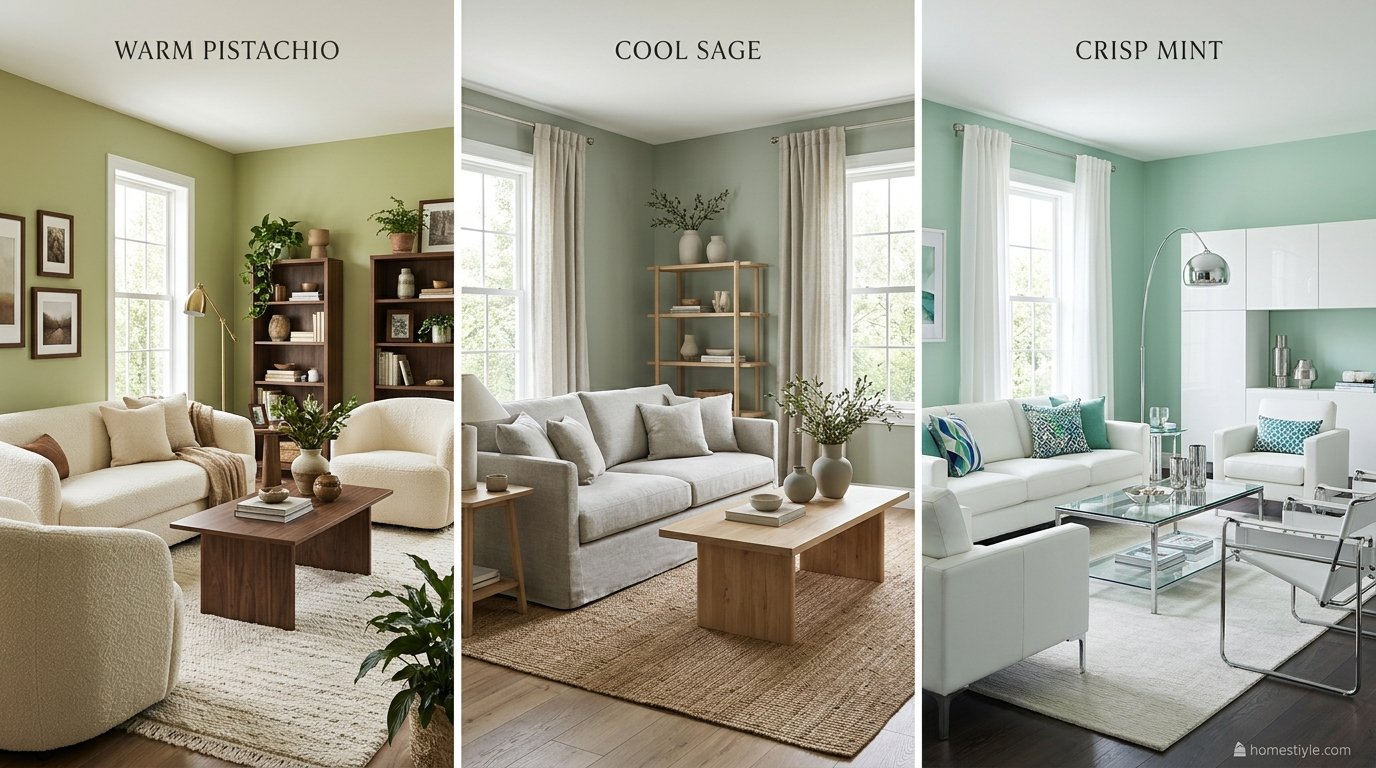
Pistachio is a pale green with a yellow base and just enough muting to keep it sophisticated.
Its lightness is the point: the named paints run from an LRV of about 53 to 84, a band where a color can cover four walls and still feel like daylight.
Its warmth is the other point. Where sage spends its energy on gray, pistachio spends its on sunlight, which is why the same room feels fresher in pistachio and moodier in sage, and why the pairing partners differ completely.
The Pale Family Map: Four Light Greens, Four Temperatures
|
Green |
Undertone |
Depth |
Best Living Room Job |
|---|---|---|---|
|
Pistachio |
Warm, yellow leaning |
Pale, LRV 53 to 84 |
Bright rooms, small rooms, walls and built ins |
|
Mint |
Cool, blue leaning |
Pale and brighter |
Crisp modern rooms, white and chrome schemes |
|
Sage |
Cool neutral, gray first |
Light to mid |
Calm gray friendly rooms, pale wood schemes |
|
Moss |
Warm, yellow leaning, muted |
Mid tone, LRV 20 to 30 |
Wood heavy rooms, sofas, weight and coziness |
The family’s deep end is covered in our forest green living room ideas, and its cool silvery branch in the eucalyptus green living room ideas.
Pistachio and moss share the yellow base and the same friends; they differ only in how much light each one brings.
The Name Trap: When Palest Pistachio Is Not Pistachio
Benjamin Moore sells a paint called Palest Pistachio 2122-60, and it is the palest in this article at LRV 83.84.
It is also, by the reference data, not a warm pistachio at all: the Palest Pistachio comparison data puts its hue at 160 degrees, deep in blue green territory.
Hang it in a warm room and it reads as a cool mint tint, and the owner concludes that pistachio is a cold color. The color is fine; the name lied.
Every ladder below is therefore sorted by hue and LRV, never by what the can is called.
The Paint Ladder: Named Pistachios by Depth
All figures here are reference data computed from the manufacturers’ own published color values, labelled as such. No brand published LRV for these paints was located, so none is claimed; the ladder’s job is comparison, and comparison is what the data does reliably.
The Classic Band: LRV 60 to 73
|
Paint |
Code |
LRV (reference data) |
Hue |
Character |
|---|---|---|---|---|
|
Benjamin Moore Light Pistachio |
2034-60 |
72.06 |
118 degrees |
The airy top of the band |
|
Benjamin Moore Pistachio |
561 |
68.65 |
112 degrees |
The classic, warm and balanced |
|
Benjamin Moore Sounds of Nature |
556 |
65.05 |
99 degrees |
The saturated retro sibling |
The classic is Pistachio 561: plan-home’s Pistachio 561 comparison shows it warmer and far lighter than the grayed greens it is compared against, at a saturation that reads as color without shouting. It is the default recommendation for a first pistachio room.
Sounds of Nature deserves its note: at the same lightness as 561 but with 54 percent saturation against 561’s 33, it is the vivid, retro member of the family, the Sounds of Nature and Oh Pistachio comparison confirms the pairing of the two in the data.
Choose it when the room’s other elements are quiet and you want the wall to sing a little.
The Deep End of Pistachio
Sherwin Williams Oh Pistachio SW 9033, at LRV 53.08 and hue 98 degrees, is the deepest true pistachio in the set: still unmistakably pale family, but with enough body to survive bright rooms and to carry built ins and furniture scale paint.
Below it sits the bridge color, Sherwin Williams Parisian Patina SW 9041 at LRV 29.74, a grayed green that behaves like pistachio’s shadow.
Use it for the deep accent inside a pistachio scheme, a media wall or a bookcase back, where a true pistachio would look lost.
The 2026 Shift: Why Designers Are Leaving Sage
The reporting behind this color is unusually well documented for a trend.
Ideal Home describes pistachio as a soft muted green with subtle yellow undertones on the warmer side of the family, and Homes and Gardens’ summer 2026 color coverage flagged designers moving off sage toward pistachio as the fresher, equally muted warm season choice.
A viral food trend helped, as viral food trends now do: the pistachio filled chocolate bar made the color a cultural shorthand before it was a paint decision. Treat the halo as weather, not climate; the sections below are built to survive it.
How to Sample a Pale Green
Pale colors shift families between lights more than mid tones do, so the board protocol matters more here, not less. Paint three boards: the classic, the deep step, and the palest you are considering.
Judge each at morning, midday, and evening, beside the sofa fabric and the floor, and interrogate the two failure directions by name: does the pale one mint in your cool light, and does the classic wash out in your bright light.
The board that survives both questions is the paint.
Placement: A Walls First Color
Deep greens climb a ladder from textiles to walls because their risk grows with scale. Pistachio’s ladder runs the other way: its risk is not darkness but dilution, and its best uses start at architectural scale.
Dose One: Textiles Only
A pistachio rug, a throw, and two or three cushions repeating the color. This is the trial and renter dose, fully reversible, and the honest way to learn whether you like living with the color’s sweetness at close range.
Dose Two: Painted Built Ins and Joinery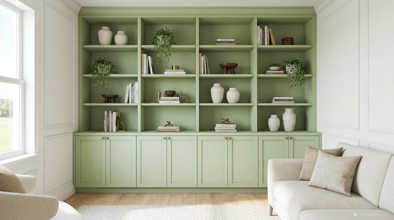
The signature move, and the one in the designer rooms that made this color famous: pistachio painted built ins lifting a pale neutral room, styled with books, cream ceramics, walnut, and brass.
Joinery is the perfect pistachio scale: large enough to transform the room, contained enough to repaint in a weekend if the trend or your taste moves on. Use a satin or enamel finish so the piece reads as woodwork.
Dose Three: The Pistachio Sofa, Grounded
A pistachio sofa on cream walls is a legitimate statement, in linen for the soft version and velvet for the dressed one.
It succeeds exactly when the grounding rule is obeyed: walnut or oak furniture with real weight, a rug with depth in its pattern, and cushions that include one deep tone.
Fail the grounding and the same sofa becomes the nursery mistake. The sofa is not the risk; the company it keeps is.
Dose Four: Full Walls and the Small Room Drench
On walls, pistachio’s lightness pays off twice: it covers a room without darkening it, and in a small room, drenching walls, trim, and ceiling in the one shade erases the seam lines that chop small spaces into smaller ones.
Keep furniture pale and compact in a drench, add one mirror, and let a single walnut or black framed piece supply the depth. This is the rare color where the boldest dose is also the safest one.
The Signature Palette: Cream, Blush, Walnut, Brass
The Foundations: Cream and Warm White
Pistachio’s foundation is cream, for the same reason moss’s is: a warm green beside a blue white reads yellow at the seam and sour across the room. Warm whites and soft beiges keep the green tasting like itself.
Run the foundation across whatever the green is not doing: if the walls are pistachio, the sofa and rug are cream; if the sofa is pistachio, the walls are.
The Classic Partner: Blush and Plaster Pink
Pink and green are color wheel opposites that behave like family, and pistachio’s canonical partner is blush. The pairing literature’s working dose is roughly 70 percent pistachio to 30 percent pink, the pink arriving through cushions, art, and one chair.
The refined version, from current designer coverage, is plaster pink: dustier, warmer, with terracotta undertones, paired with the muted green for a quieter and more grown up room than the retro bubblegum version.
The Grounding Anchors: Walnut, Charcoal, Black, Navy
Every pistachio room needs one deep anchor, chosen once and repeated at least twice so it reads as intention.
Walnut furniture is the warm anchor; a black line in lighting, frames, or a console is the modern one; charcoal and navy are the upholstery versions.
The documented designer rooms obey this without exception: black accents against the soft walls in one, a mustard sofa’s depth against the built ins in the other. Pale plus pale plus pale is not a palette; it is an omission.
The Energy Accents: Mustard and Coral
Mustard is the energy accent with a designer receipt: a mustard velvet sofa against pistachio built ins is the category’s most published room. Coral is the softer lift, in cushions and art.
Both are warm, which keeps them inside the family. Use one per room. Mustard, coral, and blush together is not a palette; it is a sweet shop.
Woods and Metals That Behave
Woods split by intention: light oak for the airy Mediterranean and Scandinavian versions, walnut when the room needs its anchor to be furniture. Orange toned woods cast the pale green sallow and are the pairing to avoid or cover.
The floor decision belongs in the same pass as the paint decision, which is why modern flooring ideas are worth reviewing before the swatches come home.
Metals follow the moss rule: aged brass first, black for modern lines, chrome only if you are deliberately building a mint room instead.
Light Rules for a Pale Warm Green
North Facing Rooms: Warm and High, or Not at All
North light strips warmth and pushes pale greens toward gray and mint.
Pistachio survives it better than mint does, under two conditions: the hue must be genuinely warm (the 98 to 118 degree family in the ladder data) and the value high, LRV around 60 or above.
Break either condition and the room gets the cool color it was trying to avoid. The Palest Pistachio trap springs exactly here, in exactly this light.
South and West Light: The Washout Problem
The opposite failure gets no press: strong sun bleaches a pale wall.
An LRV 70 wall in a bright south room can read as tinted white by midday, and the owner concludes the color is weak when the value was simply wrong for the light.
The fix is to step down the ladder in bright rooms: Oh Pistachio at 53 was built for sun. Matte finishes hold visible color better than satin under glare, and sheers return color to the wall by diffusing the light before it lands.
Bulbs and Sheen for Pale Walls
Warm bulbs at 2700K to 3000K keep pistachio in its family after dark; cool bulbs drag it toward the mint it is not. On walls, matte or eggshell keeps the color plastery and hides the flaws pale paint advertises.
Save satin for the joinery dose, where the slight sheen is the point, and expect any color to read a touch deeper in the higher sheen.
Room Recipes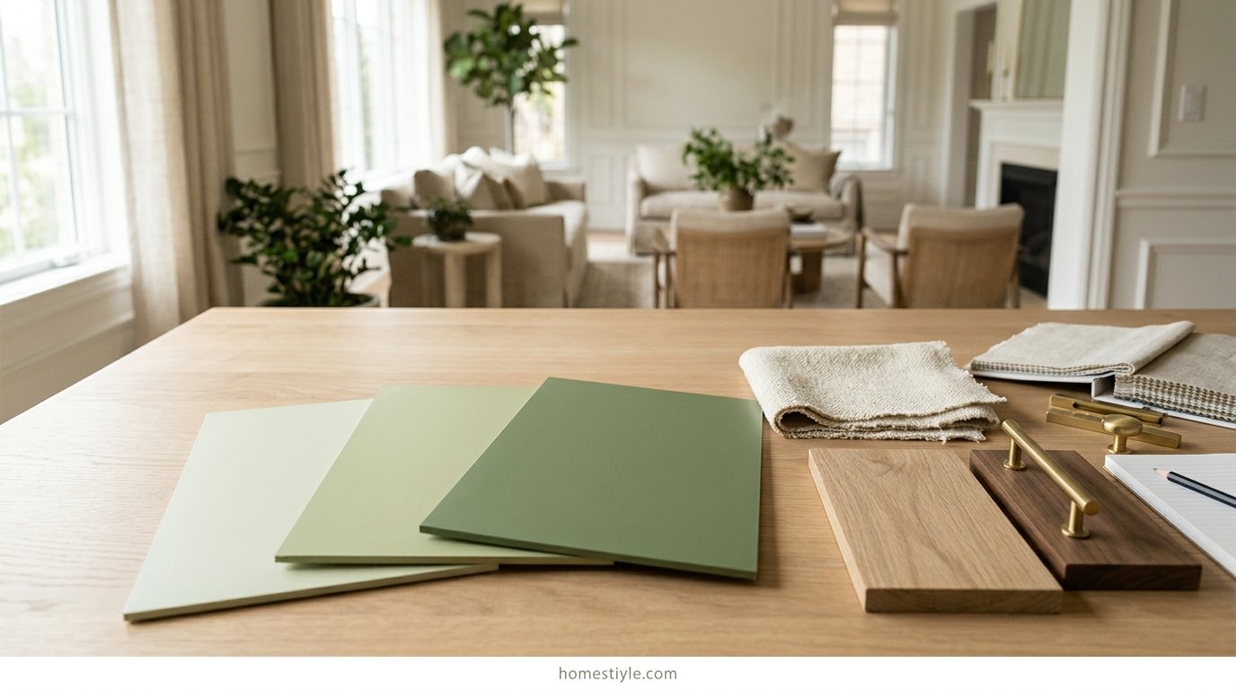
Mediterranean and Italian Summer Pistachio
Classic band walls, light oak, linen and rattan, terracotta in the ceramics, one olive tree doing the plant work. This is the color’s current home and its easiest recipe, because every element shares the same warm, sunlit logic.
Retro Pastel Pistachio
Sounds of Nature on the walls or the joinery, walnut furniture, brass, a mustard or coral accent, and pattern with confidence. Pistachio is a genuine period color for mid century rooms, which is why the retro version reads as restoration rather than costume.
Modern Pistachio With Black Lines
Pistachio kept to walls or built ins, everything else cream, pale wood, and black: black framed art, black lighting, a black console line.
The black is the grounding anchor and the style statement in one move, and it is what separates this recipe from the pastel default.
Cottage and Grandmillennial Pistachio
Florals that repeat the green at low volume, blush at the 70 30 dose, checks and stripes in cream, books and collected objects. The grandmillennial version adds pattern discipline: one large pattern, the rest plain or fine.
Small and Rental Friendly Pistachio
Small rooms take the drench; renters take the textiles. Layout carries as much of a small room as color does, and our small living room layout ideas apply unchanged inside a pistachio scheme.
For the renter’s furniture scale version, a painted thrifted bookcase in the classic band delivers the built in effect without touching a wall.
Open Plan Pistachio
A pale color zones weakly, so give it the whole floor’s walls and mark the living zone with furniture, rugs, and one deeper element, or reserve pistachio for the living zone’s built ins and keep the rest warm white.
The continuity logic in open plan kitchen living room layouts is the governing rule: never stop a pale color at an invisible boundary and expect it to look intentional.
Before You Commit: Dose, Durability, and the Decade Test
|
Dose |
Cost Level |
Commitment |
Trend Exposure |
Best For |
|---|---|---|---|---|
|
Textiles only |
Lowest |
One afternoon |
None, fully reversible |
Renters, the nervous, testing |
|
Painted built ins |
Low to medium |
A weekend to repaint |
Low |
Neutral rooms needing one event |
|
Pistachio sofa |
Highest |
Years |
Highest |
Confident rooms with grounding planned |
|
Full walls |
Low |
A repaint away |
Low at classic values |
Bright rooms, small rooms, drenches |
Trends date at different speeds by dose, and this table is the honest version of the pistachio decision.
Wall paint at classic values and painted joinery inside a cream and walnut scheme are decade choices; pale warm greens have cycled through interiors for a century without ever fully leaving.
The sofa is the exposed purchase, because upholstery is expensive, pastel is the trend’s most visible form, and a tired sofa cannot be repainted.
Buy it last, ground it properly, and choose linen or a textured weave over a flat pastel velvet if longevity matters more than the photograph.
Whole home flow argues for pistachio too: a pale warm green at the living room can repeat at lower doses down a hallway and into a bedroom without ever shouting, because its lightness lets it behave as a colored neutral in sequence.
The sample boards remain the cheapest insurance in the entire project. Three paints, one day, two questions, and the ladder and the light rules stop being theory and become a decision you watched happen in your own room.
One last durability note: pistachio is kind to future changes.
A pale warm wall accepts the next sofa, the next rug, and even the next color cycle more gracefully than a saturated one does, because nearly every warm palette can be built on top of it without repainting first.
Mistakes That Make Pistachio Look Wrong
Mint by accident. Buying the name instead of the hue, or lighting a warm pistachio with cool bulbs until it changes families. Both are sampling failures, and both are preventable in one afternoon with three boards.
Nursery by default. Pale green plus pale pink plus white furniture plus soft shapes, with no anchor and no texture. The color did not do this; the missing walnut did.
Floating by omission. Refusing all dark elements on principle, as some ranking advice literally instructs, and producing a room with no floor, visually speaking. One anchor is not a compromise of the pastel idea; it is what makes the pastel idea readable.
Washed out by value. The classic band in a sun blasted room, judged at the kind hour instead of the bright one. Step down the ladder and the same room holds its color all day.
Frequently Asked Questions
What color is pistachio green?
Pistachio green is a pale, soft green with a warm yellow leaning undertone, named for the inside of the pistachio nut.
The paints that carry its name run from about LRV 53 to 84. The classic, Benjamin Moore Pistachio 561, sits at LRV 68.65 with a hue of 112 degrees in reference data.
Is pistachio green warm or cool?
Warm, with one famous exception. True pistachios lean yellow: Pistachio 561 sits at hue 112 degrees and Oh Pistachio at 98 degrees.
The exception is Palest Pistachio 2122-60, whose hue of 160 degrees puts it on the blue side despite its name. Judge paints by undertone, never by the label.
What is the difference between pistachio green and sage green?
Temperature and freshness. Sage is a gray first green that leans cool and dusty; pistachio is a yellow first green that leans warm and fresh.
That is why designers are switching: pistachio is the equally muted but fresher choice, as the summer 2026 color reporting documented.
What is the difference between pistachio green and mint green?
Direction of undertone. Mint leans blue and reads cool, crisp, and brighter; pistachio leans yellow and reads warm, soft, and earthier.
Mint wants white, chrome, and cool grays. Pistachio wants cream, warm wood, and brass. If a chip looks like toothpaste, it is mint.
What is the difference between pistachio green and moss green?
Depth, mostly. Moss is pistachio’s warm cousin several shades down the ladder, at LRV 20 to 30, where pistachio is pale at 53 to 84.
They share the yellow base and the same friends, cream, walnut, and brass, so the two layer beautifully in one home.
What colors go with pistachio green?
The proven palette: cream and warm white as the foundation, blush or plaster pink as the classic partner, walnut and light oak as the woods, aged brass as the metal.
Add one deep anchor, charcoal, black, or navy, to ground the paleness. Ration the other pastels, or the room floats.
What is the best pistachio green paint color?
Benjamin Moore Pistachio 561 is the classic: LRV 68.65 in reference data, warm at hue 112 degrees, light enough for whole rooms.
Sounds of Nature 556 (LRV 65.05) is the saturated retro sibling. Sherwin Williams Oh Pistachio SW 9033 (LRV 53.08) is the deepest true pistachio.
What LRV should a pistachio green living room paint be?
The classic band is LRV 60 to 73, where Pistachio 561 and Light Pistachio 2034-60 sit.
In dim or north facing rooms, stay high in the band with warm hues. In bright south rooms, the deeper Oh Pistachio at 53 survives the sun. Above about 80, a green behaves as a tinted white.
Does pistachio green work in a north facing living room?
Yes, if you choose the warm members of the family and keep the value high: hue on the yellow side, LRV around 60 or higher, warm bulbs, cream beside it.
North light pushes pale greens toward gray and mint. Avoid the cool leaning names, above all Palest Pistachio.
Why does my pistachio green look like mint?
Because the paint leans blue, or your light is making it lean blue. Cool leaning pale greens read as mint in most lights, and even a true pistachio can mint under cool bulbs.
Resample toward the warm names, warm the bulbs to 2700K, and add cream and warm wood to pull the green back.
What color sofa goes with pistachio green walls?
Cream and warm white linen first, because the walls are already the color and the room needs a calm light mass.
A paler pistachio linen sofa, a step lighter than the walls, is the designer version. Avoid a gray sofa: cool gray against warm pale green makes the walls look sour.
What wall color goes with a pistachio green sofa?
Cream or warm white, so the sofa reads as the room’s one soft color statement.
Ground it from elsewhere: walnut or light oak furniture, a rug with depth in its pattern, and cushions in blush, cream, and one deep tone.
How do I stop a pistachio room looking childish?
Ground it and texture it. The nursery effect comes from pale color plus pale everything plus soft shapes.
Add one deep anchor, walnut, charcoal, black, or navy, grown up materials like linen, boucle, marble, and aged brass, and one sophisticated pattern or piece of art.
What color curtains go with pistachio green?
Cream and ivory linen, sheer or lined, is the default with both pistachio walls and a pistachio sofa.
For pattern, a soft floral or stripe that repeats the green at low volume. Heavy dark drapes fight the color’s whole purpose, which is lightness.
What wood tones go with pistachio green?
Two woods carry it in opposite directions: light oak for the airy Mediterranean version, and walnut for the grounded, traditional, and retro versions.
Avoid orange toned pine and honey oak, which cast the pale green sallow. Dark floors work as the room’s anchor if the rug is light.
What is the best metal with pistachio green?
Aged brass, because warm metal completes a warm color and reads grown up.
Rose gold works in small deliberate doses but sweetens the palette and dates faster. Chrome cools the room toward mint. Black metal is the modern option for grounding lines.
How much pink should I use with pistachio green?
The pairing literature’s working ratio is about 70 percent pistachio to 30 percent pink, with the pink arriving through textiles, art, and one chair.
Choose plaster and blush tones over bubblegum. The current designer version pairs the muted green with warm blush and terracotta undertones.
Can pistachio green work in a small living room?
It is one of the best small room colors, used whole: drenching walls, trim, and ceiling in one shade erases the visual seams that chop a small space up.
Keep furniture pale and compact, use one mirror, and let a single deep anchor supply the depth the color does not.
Can I use pistachio green if I rent?
Yes, through textiles: a pistachio rug, a throw, and two or three cushions repeating the color deliver the look with zero paint.
A slipcover or a painted thrifted piece adds furniture scale. A classic band pistachio is also an easy color to paint back over.
Does pistachio green make a room look bigger?
Light colors make rooms feel larger and more luminous, and pistachio is on the published lists of shades that do it.
The effect is strongest used continuously, drenched or near drenched, with pale furniture, and weakest when one pale wall is boxed in by dark furniture.
What sheen should pistachio green wall paint be?
Matte or eggshell. Pale colors show every flaw and sheen difference, and a soft finish keeps pistachio looking plastery and calm.
Eggshell is the living room compromise. On built ins, step up to satin or a furniture enamel, and expect the color to look a touch deeper.
What is color drenching and does pistachio suit it?
Drenching paints walls, trim, and ceiling in one color family, removing contrast lines.
Pistachio suits it unusually well because it is light: a drenched pistachio room feels enveloping and bright, not cave like. Keep textiles tonal and supply one deep anchor.
Why do my pistachio walls look washed out?
Too much light for the value you chose. In strong south or west sun, an LRV 70 plus wall can bleach toward white by midday.
Step down the ladder in bright rooms, use matte finishes, judge samples at the brightest hour, and diffuse the sun with sheers.
How do I test pistachio paint before committing?
Sample at least three: one classic, one deeper, and the palest you are considering, painted on large boards.
Judge them morning, midday, and evening, beside your sofa fabric and floor, and check both failure directions: minting in north light, washing out in south light.
Is pistachio green just a trend that will date?
It is a trend now and a recurring color always. Treat the most exposed purchases, a pastel sofa or a full pastel scheme, as five year decisions.
Pistachio as wall paint or painted joinery inside a cream and walnut scheme will outlast the cycle comfortably. Buy the trend at textile scale.
What styles does pistachio green suit?
Mediterranean and Italian summer schemes, retro and mid century rooms where it is a period color, cottage and grandmillennial rooms with pattern, and modern rooms disciplined by black lines.
It suits formal traditional and high drama schemes least, where its lightness reads as indecision.
Can pistachio green work with a gray sofa?
With effort, and only if the gray is warm. A blue gray sofa pulls a pistachio wall toward mint.
Bridge them with a cream and blush cushion layer, a warm rug, walnut beside the sofa, and warm lighting. Judge the paint board against the actual sofa fabric first.
What rug goes with a pistachio green living room?
A cream or warm ivory rug for the airy schemes, a jute or natural weave for the Mediterranean version, and a patterned rug with depth when the room needs its anchor on the floor.
With pistachio walls, the rug should be lighter than or equal to the walls, never a competing pastel.
What accent colors add energy to a pistachio room?
Mustard yellow and coral, in small doses. A mustard velvet sofa against pistachio built ins is the documented designer example.
Both accents are warm, which keeps them inside the family. Use one energy accent per room, not both with blush as well.
How do I use pistachio green in an open plan living room?
Carefully, because a pale color zones weakly. Run pistachio as the all over wall color and mark zones with furniture and rugs, or reserve it for the living zone’s built ins.
Never stop a pale wall color at an open boundary without furniture or a beam to justify the stop.
What color should trim be with pistachio green walls?
The same warm white family as your other rooms, or the pistachio itself in a drenched scheme.
A stark blue white trim makes the warm green read yellow at the edges. Cream trim keeps the whole wall calm, and a step above the wall is the classic traditional construction.
Can I paint built ins or a bookcase pistachio green?
It is arguably the color’s best use. Pistachio built ins lift a neutral room without wall commitment and carry books and objects beautifully.
Use a durable satin or enamel finish, style shelves with cream, walnut, and brass objects, and keep the walls warm white so the joinery is the event.
What color flooring works with pistachio green?
Light oak for the airy versions, mid tone and walnut floors for the grounded ones. Dark floors are an asset, supplying the anchor a pale color needs, if the rug is light.
Manage orange toned floors with the rug at the contact line and a calmer wood repeated in the furniture.
Does pistachio green show dirt easily?
On walls, pale colors show scuffs more than mid tones, which argues for wipeable eggshell and keeping the palest values off high traffic corners.
On upholstery, choose performance fabrics and washable covers. The honest trade: pistachio buys light and freshness, and charges a little maintenance.
What plants go with a pistachio green room?
Plants layer tonally: choose greens both deeper and brighter than the walls so leaves read as events, not camouflage.
Structured plants suit the Mediterranean version; trailing plants soften built ins. Terracotta, cream, and brass planters repeat the palette.
How is pistachio green different from seafoam?
Seafoam leans blue green and foamy, cooler and more aquatic; pistachio leans yellow green and nutty, warmer and more earthy.
Seafoam wants white and chrome in coastal palettes. Pistachio wants cream and brass in living rooms. Hue, not the label, decides which one you bought.
What is the Dubai chocolate effect on pistachio interiors?
The viral pistachio filled chocolate turned the color into a shorthand for indulgent freshness, and UK retail coverage credits the trend with spreading it through home decor.
Treat it as a demand signal, not a design rule. It will fade on a food trend’s schedule, faster than a paint cycle.
Should I choose pistachio or sage for my living room?
Choose by light and wood. Sage for cool, bright rooms with pale woods, gray sofas, and silver tones. Pistachio for warm, wood heavy, or north facing rooms, and for anyone tired of gray.
Sample both families side by side, and buy by undertone, not by name.
What ceiling color works with pistachio walls?
Warm white for the standard construction, the pistachio itself for a drench, and a pale blush only in rooms built on the pink and green pairing.
A bright blue white ceiling reintroduces the cool contrast the walls were chosen to avoid. In drenched small rooms, the ceiling in the wall color completes the effect.
Can pistachio green work in a traditional living room?
Yes, in its grounded form: classic band pistachio with cream trim, walnut and mahogany furniture, a Persian style rug, brass lamps, and pattern in the cushions.
What makes pistachio read childish is the company, not the color: white lacquer and pastels push it young; dark wood and pattern push it classic.
How much does a pistachio green living room refresh cost?
By dose. Textiles only is the smallest spend and fully reversible. Paint is the cheapest transformation per square foot, usually two coats over a light base.
Built ins are a paint or carpentry budget. A pistachio sofa is the major, most trend exposed purchase, so buy it last.
Where should I start with pistachio green if I am nervous?
With three sample boards and one textile: the classic, the deep, and the palest pistachio, judged across a full day, plus a pistachio throw on your sofa for a week.
Pale colors forgive nervous starts, because every dose is light enough to live with while you decide.
Conclusion
Pistachio green living room ideas reduce to three habits: buy the color by hue and LRV rather than by name, place it at architectural scale where its lightness is an asset, and give every room its one deep anchor.
Start with the boards: the classic, the deep step, and the palest, judged through one full day of your light, with the mint question and the washout question asked out loud.
Then paint the built ins or the walls, dress the room in cream, blush, and walnut, and let the freshest green of the decade do what it came to do.

1 thought on “Pistachio Green Living Room Ideas: The Light Warm Green, Kept Grounded”