
Mint green bedroom ideas succeed or fail on one number: how light the paint is. Mint is not a mid tone color that forgives guessing. It is a pale, cool green that lives near white.
That paleness is the gift and the trap. At the right lightness, mint bounces light, cools a warm room, and reads as fresh air in paint form.
At the wrong lightness, it turns gray in dim light or slides into toothpaste territory. Both failures are predictable once you shop by rung instead of by name.
So this page works by ladder. Pick the rung for your light, pass the toothpaste test, then spend your warmth budget on wood, brass, cream, and texture.
What Mint Green Is in a Bedroom: Pale, Cool, and Light Hungry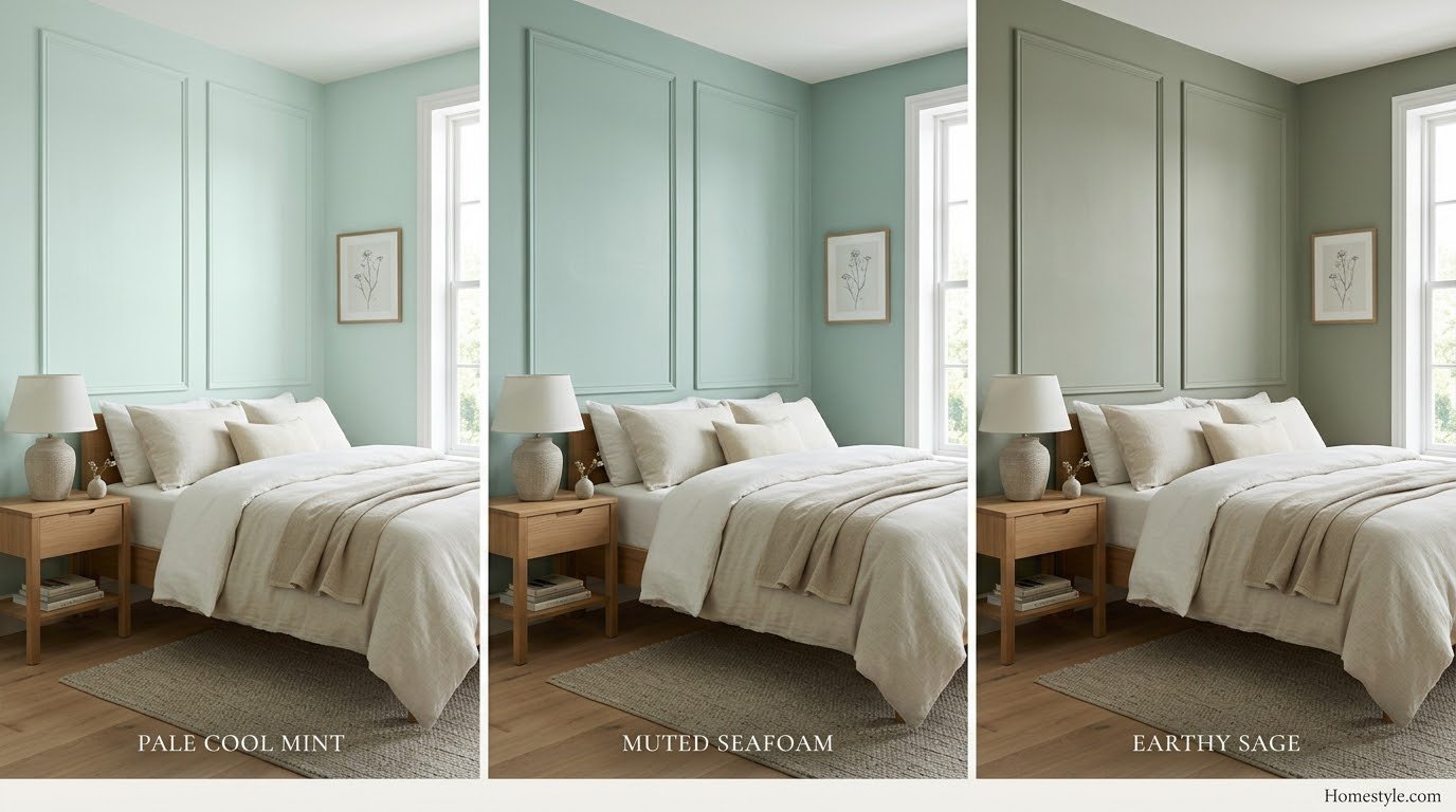
Mint is green cooled toward blue and lifted toward white. It sits at the pale end of the green family, well above sage in lightness.
In a bedroom, that profile has a specific personality. Mint feels clean, airy, and morning like, even at midnight under the right bulbs.
It is also light hungry. Saturated colors carry their own presence; pale colors borrow presence from the room’s light.
When the light is weak, mint has nothing to borrow. The green fades, the gray base shows, and the wall reads tired.
Mint, Seafoam, and Sage: The Three Pale Greens
The three names describe three settings of the same family. Sorting them first prevents most wrong purchases.
Mint is the palest and coolest, leaning slightly blue. It reads crisp, sweet, and retro, the ice cream parlor and 1950s kitchen color.
Seafoam sits a touch grayer and greener. Named for ocean foam, it reads coastal and muted, and it is usually the safer wall choice.
Sage is the gray heavy, earthy sibling. It behaves almost like a neutral and forgives the low light that punishes mint.
Pistachio green living room ideas covers the warmer yellow leaning neighbor. Pistachio shows what this family does when the lean turns toward warmth instead of cool.
Why Mint Behaves Like a Light Color, Not a Mid Color
A mid tone color holds its identity in most lights. A pale color negotiates with every light source it meets.
That is why mint shifts so much between the chip and the wall. At wall scale, your eye reads the undertone, not the name.
It is also why two mint bedrooms can share a paint and feel unrelated. The rooms’ light, floors, and bedding finish the color.
Shop accordingly: the sample is not a formality with mint. It is the decision itself, read on two walls at three times of day.
The LRV Ladder: Pick the Rung for Your Light
LRV measures how much light a color reflects, from 0 to 100. For mint, LRV is not a detail. It is the product.
The ladder below uses figures as their sources report them. Where a number rests on one source, the table says so, because a bedroom deserves honest data.
|
Paint |
Brand and Number |
LRV (as reported) |
Lean |
Best Use |
|---|---|---|---|---|
|
Creme de Mint |
Benjamin Moore 2036-70 |
about 85 |
pale, clear |
bright rooms, ceilings |
|
Light Mint |
Benjamin Moore 2046-70 |
81.84 (single source strand) |
pale, bright |
small rooms, max bounce |
|
Mint Condition |
Sherwin-Williams SW 6743 |
73.03 |
standard, slightly saturated |
most bedroom walls |
|
Mint Chocolate Chip |
Benjamin Moore 436 |
about 71 |
warmer, gray softened |
walls with warmth built in |
|
Retro Mint |
Sherwin-Williams SW 9036 |
about 54 |
saturated rung |
dim and north rooms |
|
Breaktime |
Sherwin-Williams SW 6463 |
not verified here |
clean, cited as non toothpaste |
walls, sample first |
The Near White Rungs (LRV About 80 to 85)
The top rungs are mint tinted whites. Creme de Mint at about 85 barely declares itself in bright light.
Use them where the room is small, sunny, or both. They deliver the freshness with almost no risk of the color taking over.
ArtFasad’s mint bedroom guide for couples cites Light Mint at 81.84 for maximum brightness. That figure rests on that guide alone, so treat it as a strand and let your sample confirm the character.
On ceilings, these rungs are the surprise move. A mint tinted ceiling over white walls reads like sky, provided the room has the height for it.
The Standard Wall Rungs (LRV About 70 to 75)
This is where most bedroom mints should live. Plan Home’s Mint Condition comparison data puts Mint Condition at 73.03, with a hue leaning clearly green.
At this depth, mint survives average light without going gray by supper. It is the rung for main bedrooms and guest rooms alike.
Wild Fox Painting’s Mint Chocolate Chip data page lists Mint Chocolate Chip at about 71, with a warmer, softer character. Its cross brand matches show how wide the mint family really is.
Breaktime belongs in this conversation by reputation. Designers cite it as the clean mint that avoids toothpaste, but sample it rather than trusting any description, including this one.
The Saturated Rung (LRV About 54) for Dim Rooms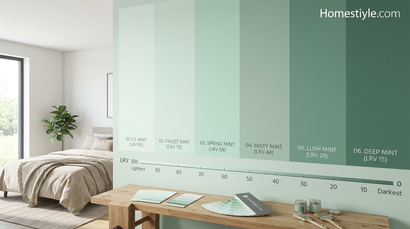
Dim rooms need more color, not less. Retro Mint at about 54 carries enough chroma to stay green when the light gives up.
This rung suits north facing bedrooms, low window rooms, and accent walls behind the bed in any aspect.
It will feel stronger at noon in summer. That is the trade you accept for a wall that still reads mint in February.
If even this rung feels bold, the honest alternative is sage. A grayer green at similar depth behaves better in the dark than any true mint.
The Toothpaste Line: The Test and the Three Fixes
Every mint shopper knows the fear. The wall dries, the light changes, and the bedroom suddenly advertises dental hygiene.
The line is crossed by a combination, not a color. A blue white mint, with no gray in it and nothing deep in the room, reads as a product label.
Run the test before you buy. Does the swatch read blue white? Is there any gray softening it? Does the room hold a deep anchor anywhere?
The safe pattern is a swatch with some gray in it and an anchor planned for the room. If the swatch fails, the fixes rank like this: step toward a gray softened mint, step one rung deeper, or add the anchor first and retest.
Texture is the quiet fourth fix. Linen, wool, and matte finishes absorb the freshness that glossy surfaces shout.
Light Scenarios: North, South, and Low Window Rooms
Two ranking guides contradict each other on north light, and the contradiction is useful. One promises mint enlivens a north facing bedroom; another warns mint turns gray in dark rooms, no exceptions.
Both are half right. Pale mint in weak north light collapses; saturated mint with warmth donors survives it. The rung and the room decide which sentence you live in.
North Facing: Saturation Compensation, Not Paler Paint
North light is cool, indirect, and weak. It starves pale colors of the energy they need to read as colors.
The instinct to go paler is exactly wrong. Paler mint has less chroma to lose, so it grays first and worst.
Compensate instead: choose the saturated rung, fit warm bulbs, and load the warmth donors this page covers next.
Eucalyptus green living room ideas shows a soft green holding its own in gentle light. Eucalyptus tones demonstrate the gray green direction to step toward if mint keeps collapsing.
South Facing: Where Pale Mint Earns Its Keep
Southern sun is mint’s home fixture. Full daylight feeds the paleness, and near white rungs glow instead of disappearing.
This is the room for the top of the ladder. Creme de Mint strength walls, white bedding, and light wood make the classic bright coastal bedroom.
Watch the midday peak in summer. If the room tips toward neon freshness, texture and cream pull it back without a repaint.
Evening Light and Warm Bulbs on a Cool Color
Bedrooms are evening rooms, and evening means artificial light. Warm bulbs at 2700 to 3000K pour amber over a cool color.
On mint, that amber is a correction, not a distortion. It takes the clinical edge off and moves the room toward rest.
Read your sample under the bulbs you actually sleep with. A mint chosen under store daylight is a mint chosen for someone else’s bedroom.
Dimmers protect the whole system. Bright overhead light at night fights every calm color, mint included.
Warmth Balance: The Heating System Mint Needs
Mint donates coolness to a bedroom. The room must donate warmth back, or the sleeper feels the deficit at night.
Treat warmth as a budget with four currencies: wood, brass, cream, and texture. Spend at least two in every mint bedroom.
Wood, Brass, Cream, and Texture as Warmth Donors
Wood is the largest donor. A walnut or oak bed and nightstands warm whole sightlines at once.
Brass donates in small, bright doses: lamps, hardware, a mirror frame. It reads elegant against mint precisely because it is warm.
Cream is the textile donor. ArtFasad’s mint green and cream bedroom guide builds a whole pairing on it, including its best rule: mix at least three fabric weights so mint and cream do not go flat.
Texture is the invisible donor. Linen, wool, knit, and cane roughen mint’s smoothness, and roughness always reads warmer than gloss.
Why Chrome and Stark White Turn Mint Clinical
Chrome is a blue white metal. Stark white is a blue white surface. Mint is a blue green color. Stack the three and the room has no warm note left.
That combination has a name in everyone’s mind: the dentist’s office. ArtFasad’s mint green and cream bedroom guide warns against chrome with mint for exactly this reason.
The fix is not banning metal or white. Swap chrome for brushed brass or nickel, and stark white for warm white, and the same room relaxes.
Sand living room ideas shows the warm neutral version of the rescue. Sand tones are what cream grows into when a room needs even more heat.
The Pairings, by Job
Each partner does a job in a mint bedroom. Assign the jobs clearly and the palette builds itself.
White: The Fresh Frame
White is mint’s classic partner and the boutique hotel formula: mint walls, white bedding, bright trim.
For The Love of Living’s mint green bedroom guide builds its lead pairing on exactly this, naming Benjamin Moore’s Mint Green 2042-70 against bright white trim.
Keep the white warm leaning unless the room runs hot and bright. Blue white is the clinical risk already covered.
Cream: The Warmth Donor
Cream does the job white cannot: it heats the palette while staying light. Mint and cream sit close on the wheel, separated by temperature.
That temperature gap is the interest. Without it, or without texture contrast, the pairing goes flat and sleepy in the wrong way.
Tufted headboards, sateen against linen, knit over cotton: the cream page’s fabric rule is the whole game here.
Blush: The Soft Complement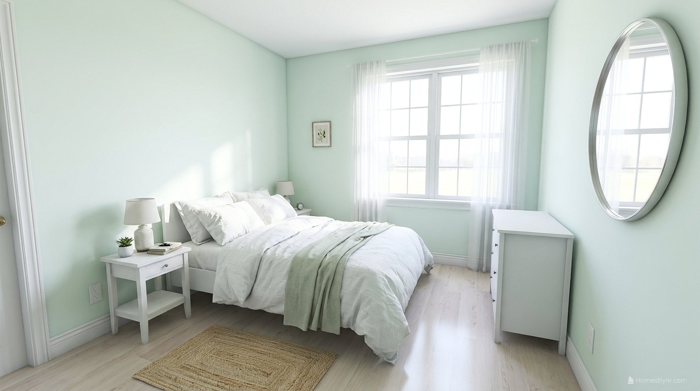
Blush pink donates warmth and softness in one move. A blush headboard against mint walls is a proven gallery formula.
Keep both colors muted and let white bedding mediate. Two candy pastels at full strength turn serene into sugary.
Navy and Black: The Anchors
Pastels need one deep note to read as designed. Navy bedding or a trunk at the foot of the bed gives mint walls their weight.
Black is the Deco anchor: mint, white, and black was an Art Deco combination a century ago, and it still reads crisp and sophisticated.
Forest green living room ideas shows the deep green end of anchoring. A forest tone near mint demonstrates how much depth a pale green can hold beside it.
Gray: The Bridge to Sage Territory
Gray cools mint into a contemporary register and bridges it toward sage. Gray bedding on mint walls is the modern, gender neutral version.
Guard the combination’s one risk: mint plus gray plus chrome is the coldest palette available. A wood donor is mandatory here.
Moss green living room ideas explores the gray green middle ground. Moss shows where the bridge lands when gray and green fully merge.
Dosing Mint: Walls, Half Walls, Bedding, Furniture
Full walls suit the standard rungs in decent light. This is the envelope dose: freshness everywhere, balanced by the warmth budget.
Half walls and wainscoting put mint at body height with white above. The dose adds architecture, suits low ceilings, and keeps the pale color where warm furniture balances it.
The accent wall behind the bed is the safest paint dose. One wall at saturated strength outperforms four walls at pale strength in weak light.
Bedding only is the rental dose: white walls, mint duvet or throw, repeated in art and one painted piece. The color lives at the room’s focal point for the price of a textile.
Painted furniture is the project dose. A mint dresser or nightstands against neutral walls carry vintage character and can be repainted in an afternoon.
Mint for Couples, Guests, Nurseries, and Teens
For couples, mint is a negotiated neutral. It reads fresh rather than gendered, and the dressing decides the rest.
Dress it one way with browns, grays, and darker greens. Dress it the other with cream, white, and blush. The wall never has to change.
For guests, pale mint plus white bedding is the boutique formula. Add blackout curtains, because hospitality is measured in sleep, not swatches.
For nurseries, mint outlasts the baby stage. It grows into a child’s room and then a teen’s with textile changes only, which no pink or blue can promise.
For teens, mint is the acceptable pastel: fresh enough to feel chosen, pale enough to host posters, gaming gear, and black furniture without a fight.
Mint by Style
Coastal mint skips the props: mint, white linen, light wood, one navy anchor. The palette says shore without a single shell.
Cottage mint layers florals, painted furniture, and cream. Distressed finishes and wicker were made for this color.
Scandinavian mint is one soft note in a white, light wood room. Low furniture, clean lines, three colors maximum.
Deco mint takes the black and white pairing, geometric patterns, and brass or chrome in period doses. Crisp is the brief.
Boho mint layers pattern, rattan, and plants over the pale base. Keep the largest element quiet so the collection reads calm.
Vintage mint leans into the 1950s inheritance: painted pieces, retro shapes, and modern white bedding to keep it curated rather than themed.
Sleep Claims, Graded Honestly
Paint marketing says soft greens promote tranquility and sleep. The tranquility half is fair; the sleep half needs grading.
Color genuinely sets ambience: a calm, low stimulation room helps the mind downshift before sleep. That effect is real and subjective.
Sleep quality itself runs on darkness, cool air, and routine. No wall color outperforms a blackout curtain and a cooler room.
So choose mint for how the room feels at bedtime, and let curtains, temperature, and light discipline do the physiology. That is the honest version, and it is enough.
Rentals and Budgets: The Bedding First Ladder
The ladder starts at textiles: a mint throw, cushions, and art over white bedding, repeated three times so it reads as a palette.
Next rung: one painted furniture piece. A dresser in a standard rung mint transforms a landlord white room for the cost of a sample pot habit.
Next: curtains, in cream or mint if the walls stay neutral. Window textiles change a bedroom’s whole light mood.
The top rung is paint or an upholstered headboard. Climb only as far as the room rewards; every rung is a legitimate stopping point.
Rescue Moves: Too Cold, Too Gray, Too Sweet
Too cold means the warmth budget is unspent. Add wood at the bed, brass at the lamps, cream on the bed, and a rug underfoot before touching paint.
Too gray means the rung is starved. Warmer bulbs and texture help first; if the wall still collapses by evening, the fix is one rung more saturated, on the bed wall first.
Too sweet means the anchors are missing. One navy or black element, grown up materials, and fewer candy companions return the room to adult.
Too flat, the mint and cream failure, is a texture problem. Add a third fabric weight and one patterned piece before changing any color.
A Worked Mint Bedroom, Step by Step
- Read the light. Note the aspect and window count. North or dim means the saturated rung; bright or small means the ladder’s top.
- Pick the rung, then the paint. Standard rung first for most rooms: Mint Condition strength, sampled on two walls at three times of day.
- Pass the toothpaste test. Blue white swatch, no gray, no anchor planned means adjust the paint or the plan before money moves.
- Set the bed. White or cream bedding as the constant, with three fabric weights layered so the bed reads warm against the cool walls.
- Spend the warmth budget. Wood nightstands, brass lamps, one textured rug. Two currencies minimum, three if the room faces north.
- Place the anchor. Navy throw or black framed art, one deep note, positioned where the eye lands from the door.
- Read it at night. Under your real bulbs, check for cold and gray. The first fix is a donor, the second is texture, the third is one rung deeper.
1. What are mint green bedroom ideas?
Mint green bedroom ideas use mint, a pale cool green, as wall color, a half wall or accent, or as bedding and furniture accents in a bedroom.
The core decision is lightness: true wall mints sit at high LRV values around 70 to 85, so the shade must be matched to the room’s light and balanced with warm materials.
2. Is mint green a good color for a bedroom?
Yes, when the room’s light supports it.
Mint is cool, pale, and fresh, which suits bedrooms that run bright or warm.
In dim or north facing rooms it can turn gray and cold unless you choose a more saturated rung or add warmth through wood, brass, cream textiles, and layered texture.
3. What colors go with mint green in a bedroom?
White frames mint freshly, cream donates warmth, blush softens it as a near complement, navy and black anchor it, and gray bridges it toward sage.
Natural woods and brass are the warmth donors that stop mint reading cold, while chrome and stark blue white push it clinical.
4. What is the best mint green paint for bedroom walls?
Sherwin-Williams Breaktime SW 6463 is widely cited as a clean wall mint that avoids the toothpaste register.
Sherwin-Williams Mint Condition SW 6743 measures LRV 73.03 in color database comparisons.
Benjamin Moore Light Mint 2046-70 is cited at LRV 81.84 for maximum brightness, a single source strand worth sampling before trusting.
5. What LRV should a mint green paint have?
Common wall mints run from about LRV 70 to 85.
Brighter and smaller rooms suit the 78 to 85 rungs.
Average rooms sit well at 70 to 75.
Dim or north facing rooms do better stepping down to a more saturated mint such as Retro Mint SW 9036 at LRV about 54, because pale mint loses its color and turns gray without light.
6. Why does my mint green look gray?
Mint is a low saturation pastel, so weak light starves it: in north facing or low window rooms the green chroma collapses and the eye reads the gray base.
One competitor guide warns mint turns gray in dark rooms without exception.
The fixes are a more saturated rung, warmer bulbs, and warmth donors in wood and textiles rather than a paler repaint.
7. How do I stop mint green looking like toothpaste?
Apply the toothpaste test: if the swatch reads blue white, carries no gray, and the room holds nothing deep, it will read as a dental ad at wall scale.
Step toward a gray softened or slightly deeper mint, add one deep anchor such as navy, walnut, or black, and let texture absorb the freshness.
8. Is mint green too cold for a bedroom?
Mint is a cool color, so the risk is real at night and in north light.
It is balanced, not fixed: cream bedding, warm wood furniture, brass lamps, and three or more fabric textures supply the warmth mint lacks.
If the room still feels cold after those donors, the mint rung is too pale for the room’s light.
9. Mint green or sage green: which is better for a bedroom?
Mint is paler, cooler, and fresher; sage is grayer, earthier, and calmer.
Choose mint for bright, small, coastal, or vintage rooms and for maximum light bounce.
Choose sage for dim rooms, large rooms, and anyone who wants green that behaves like a neutral.
Sage forgives low light that turns mint gray.
10. What is the difference between mint green and seafoam green?
They are close cousins in the pale green family.
Mint leans slightly blue and reads crisp and sweet, the ice cream and retro kitchen color.
Seafoam leans a touch grayer and greener, named for ocean foam, and reads more coastal and muted.
At wall scale seafoam is usually the safer, less sugary choice.
11. What color bedding goes with mint green walls?
White is the classic constant: it keeps mint walls restful and photographs cleanly.
Cream is the warmer alternative and the better choice in north light.
Blush adds softness, navy adds anchor, and a mint duvet on mint walls needs pattern or texture contrast so the bed does not vanish into the wall.
12. What color curtains suit a mint green bedroom?
White or cream curtains preserve the fresh frame, with blackout lining doing the real sleep work behind sheers.
Blush curtains extend the soft palette.
Mint curtains on mint walls rarely match exactly and the mismatch shows, so carry mint at the window only when the walls are neutral.
13. Does mint green help you sleep?
The claim needs grading.
Soft, low stimulation colors support a calm pre sleep ambience, which is the honest part of the marketing.
Sleep quality itself is driven mainly by darkness, cool air temperature, and routine.
Treat mint as ambience, and let blackout curtains and lighting do the physiological work.
14. Can mint green work in a north facing bedroom?
Yes, with compensation.
North light is cool and weak, and pale mint can go gray and chilly in it.
Choose a more saturated or slightly warmer mint, fit warm bulbs, and load the warmth donors: wood furniture, cream textiles, brass, and texture.
The paler the mint, the more north light punishes it.
15. Can mint green work in a small bedroom?
Yes, it is one of its best uses.
High LRV mints bounce light and make walls recede, so a small room feels larger and fresher.
Keep the palette tight (mint, white or cream, one wood tone), use the bed as the main textile event, and avoid several competing pastel accents.
16. How do I warm up a mint green bedroom?
Add warmth donors before repainting: a wood bed or nightstands, cream or camel textiles, brass lamps and hardware, a wool or jute rug, and warmer bulbs.
Each donor lowers the room’s perceived coolness.
If the room still reads cold, the wall mint is a rung too pale for the light it gets.
17. What wood tones go with mint green?
Light oak and maple give the Scandinavian and coastal versions and keep the room airy.
Warm walnut anchors mint and suits vintage and traditional rooms.
The caution is orange toned pine and honey woods, whose warmth can fight mint’s coolness at close range; a rug or bedding layer between them settles it.
18. What metals go with mint green?
Brass and brushed gold are the recommended warm metals: they donate heat and read elegant against mint.
Brushed nickel is the cooler neutral option.
Chrome is the risk the cream pairing guides warn against, because its blue white shine plus mint plus white is the clinical combination.
19. Is mint green good for a shared primary bedroom?
Yes, mint is one of the more negotiable colors for couples because pale mint reads as a fresh neutral rather than a gendered statement.
Dress it one way with browns, grays, and darker greens, or the other with cream, white, and blush.
The wall stays; the textiles carry the taste.
20. Is mint green good for a guest bedroom?
It is close to ideal: pale mint is fresh, clean feeling, and broadly liked, and it photographs like a boutique hotel with white bedding.
Keep the dose at walls or bedding rather than both, add blackout curtains for actual sleep quality, and let one wood tone warm the welcome.
21. Is mint green good for a nursery?
Yes, and it outlasts most nursery colors: pale mint is calm for babies, works for any gender, and grows into a child’s and then a teen’s room with only textile changes.
Choose the standard wall rungs rather than the palest, so the color still reads once furniture and toys add their own noise.
22. Can I use mint green in a rental bedroom?
Yes, through the bedding first ladder: white sheets as the constant, mint in the throw, cushions, and art, then one painted furniture piece such as a dresser or nightstands.
Repeat mint at least three times so it reads as a palette.
Nothing on the walls needs to change.
23. What about a mint green accent wall?
The wall behind the bed is the natural accent: mint at standard saturation with the other walls warm white gives the room its color event where it frames sleep.
In low light rooms the accent wall is also the safer dose, because one wall of a saturated mint outperforms four walls of a pale one.
24. What about half painted mint walls or wainscoting?
Half walls are mint’s friend: mint below in wainscot or a color blocked lower half, white or cream above.
The dose suits low ceilings and small rooms, adds architecture plain rooms lack, and keeps the pale color at body height where warm furniture tones balance it.
25. Can I paint the ceiling mint green?
Yes, as the surprise move: a pale mint ceiling over white walls reads like sky and suits rooms with good height.
Keep it to the near white rungs so the ceiling lifts rather than lowers, and repeat mint once at bed level so the gesture connects.
26. What paint finish is best for mint green bedroom walls?
Eggshell is the bedroom default: a soft sheen, wipeable, and forgiving.
Matte or flat feels velvety and grown up and mutes mint’s sweetness, but shows marks more readily.
Satin amplifies saturation and shine, which pastels rarely need; reserve it for trim and painted furniture.
27. How do I test a mint green paint properly?
Paint large swatches on two walls, one in direct light and one in shade, and read them in the morning, at noon, and under the room’s evening bulbs.
Pastels shift more between chip and wall than saturated colors because the eye reads the undertone at scale.
Check the swatch against your bedding and floor before deciding.
28. Mint green walls or mint green bedding: which should I choose?
Walls give the full envelope and the light bounce, at repaint cost and commitment.
Bedding gives the color at the room’s focal point for the price of a duvet set, and leaves with you.
Bright rooms can take either; dim rooms should put the more saturated version on the bed and keep walls warm white or a deeper rung.
29. Does mint green go with gray?
Yes, gray is mint’s bridge color: a gray softened mint is halfway to sage, and gray bedding or carpet cools a mint room into a contemporary register.
Keep one warm donor in the room, because mint plus gray plus chrome is the coldest combination available.
30. Does mint green go with navy?
Yes, navy is mint’s deep anchor.
Navy bedding or a trunk at the foot of the bed gives pale walls the weight they need, and the pairing reads sophisticated rather than sweet.
The depth difference is the mechanism: pastel plus deep is a designed palette, pastel plus pastel can drift.
31. Does mint green go with blush pink?
Yes, it is the soft romantic pairing: blush is a warm near complement that donates the warmth mint lacks.
A blush headboard against mint walls is a proven gallery formula.
Keep both colors muted and let white bedding mediate, so the room reads serene rather than sugary.
32. What colors should I avoid with mint green?
Avoid the clinical trio at full strength: mint with stark blue white and chrome.
Avoid several equal pastels competing without an anchor.
Be careful with orange toned woods at close range and with yellow leaning creams beside yellow leaning mints, which can turn sour together.
These are balance failures, not forbidden colors.
33. How do I make mint green look grown up, not childish?
Muting and anchoring do the work: choose a gray softened or standard rung mint, add one deep anchor (navy, black, walnut), use grown up materials (linen, velvet, wool, brass), and keep nursery signals (tiny prints, candy pastels stacked together) out.
Deco’s black and white with mint is the historical proof the color can be sophisticated.
34. Can mint green work in a vintage or retro bedroom?
It is one of mint’s home styles: mint was a period color for 1950s kitchens and bathrooms and reads authentically with retro furniture, painted pieces, and brass or chrome in period doses.
Modernize with white bedding and uncluttered surfaces so the room reads curated vintage rather than themed.
35. Can mint green work in a modern minimalist bedroom?
Yes: mint is the single soft note in a white, light wood, and clean lined room, the Scandinavian formula.
Keep the mint to walls or one textile, the furniture low and simple, and the palette to three colors.
Minimalism forgives pastel when everything else is quiet.
36. What rug works in a mint green bedroom?
A cream or natural jute rug warms the floor plane mint cannot reach.
A muted patterned rug containing a thread of mint ties walls to floor.
Avoid a saturated mint rug under mint walls; the floor dose plus wall dose together usually overshoot, and exact matches never match.
37. How much does a mint green bedroom refresh cost?
A bedding first refresh (throw, cushions, art) lands in the low hundreds of dollars.
A repaint is typically one to two gallons plus supplies, with competitor pages citing about $45 per gallon strands for mid range paints.
An upholstered headboard or new curtains is the mid hundreds step.
Prices are strands to verify, not quotes.
38. Is mint green a good choice for resale?
Pale mint is one of the safer colors: it photographs fresh, reads as a light neutral in listings, and stagers treat it as neutral adjacent.
Saturated mint is a taste statement and may be priced as a repaint by buyers.
When resale is near, keep mint pale on walls or keep it in textiles entirely.
39. What plants suit a mint green bedroom?
Green on green works when the plant greens are deeper than the wall: a fiddle leaf, olive, or trailing pothos reads as the deep anchor in living form.
Plants also add the organic texture mint rooms need.
Keep pots in warm materials (terracotta, woven baskets) to double as warmth donors.
40. How do I use mint green in a coastal bedroom without a theme?
Use the palette, skip the props: mint walls or bedding, white linens, light wood, natural fiber texture, and one navy anchor.
The color already says shore and spa.
Literal beach signage and shell collections are what turn a coastal palette into a theme room.
41. What lighting suits a mint green bedroom?
Warm bulbs in the 2700 to 3000K range counter mint’s coolness at night, and dimmers protect the calm.
Layered light (overhead, bedside, one accent) beats a single bright source.
In the morning, east facing mint rooms glow; in the evening the warm bulbs do the same job artificially.
42. Can mint green work with dark furniture?
Yes, dark wood is one of mint’s anchors: a dark brown headboard and frames against mint walls is a classic, striking contrast the legacy decor guides used for master bedrooms.
Balance the ratio so dark pieces read as accents in a light room, not as a dark room with light walls.
Conclusion
Mint green bedroom ideas reward the shopper who thinks in rungs, not names. Mint is a lightness decision first, and every good mint bedroom starts there.
Pick the rung your light can feed. Near white for bright and tiny, standard for average rooms, saturated for the dim ones that turn pale paint gray.
Pass the toothpaste test before the gallons. Then spend the warmth budget on wood, brass, cream, and texture, because a cool color in a night room must be balanced, not just admired.
Grade the sleep claims, keep the anchors deep, and let blackout curtains do the physiology. What remains is mint’s real gift: a bedroom that feels like morning air, all day.
When you are ready to walk the green family, our pistachio, moss, eucalyptus, and forest green guides at HomeStyle carry the same light first system across every depth of green.

1 thought on “Mint Green Bedroom Ideas: A Lightness Decision, Balanced With Warmth”